Robbins & Risala
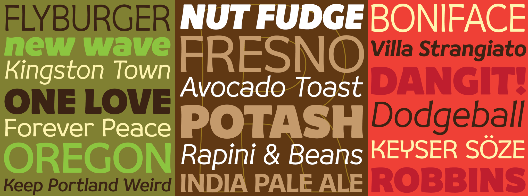
Robbins
If one thing is utterly unambiguous about Robby Woodard’s typefaces, it is that he likes them to be fun at both creation and use ends. He has a blast making them and he makes sure they’re a blast to use. He probably started developing this delightful modus operandi early on in his design career in late 1970s California. We clearly saw it with Quirkwood, and now we’re seeing it in spades with Robbins. If Quirkwood is the sugar rush of the French Clarendon, Robbins is the licorice twist of the standard sans serif.
Robbins checks all the boxes on the friendly flags list. Soft corners, aperture, bounce, elasticity, flow and even a bit of trompe-l’œil in some settings. But most of all it is an inviting and pleasant read. Its unique synergy between caps and lowercase also gives it a range flexibility that amplifies the deco fun in display and emphasizes the reading comfort in smaller size settings. And with six weights and accompanying italics, the versatility is cranked up quite a bit.
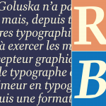
Risala
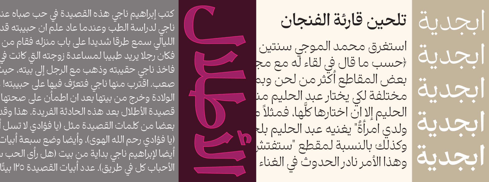
Kourosh Beigpour found himself in a state of déjà-vu about halfway through his work on this project. The original task was simply to design an Arabic companion for Orpheus Pro, but now — in an uncannily similar way to what happened with Anaqa a couple of years ago — the design seemed to be pairing attractively with pretty much any digital serif font out there, particularly the transitional genre. This was quite the meaningful discovery because for most layout artists trying to find fitting Arabic counterparts to most standard serif faces had been a puzzling task that usually ended with some kind of reluctant compromise.
Kourosh’s latest, Risala (an Arabic word meaning a written letter or message) is a veritable tour de force in Arabic type design. It also marks the third Arabic genre he publishes with us (after his quasi-Kufic work on Anaqa and his magnificent take on Ruq’ah with Qasida). Risala is quite informed by contemporary design tools and modern aesthetic influences, but it’s also deeply rooted in the natural flow of the classic Naskh/Muhaqqaq traditions. Risala is arguably Kourosh’s best type design so far, and certainly counts as one of the most appealing Arabic faces in contemporary design.