Quirkwood
If you thought the reverse-stress slab had already been done to whatever potential it ever possessed, think again. Robby Woodard, the veteran designer who cut his teeth on advertising and branding typography in the 80s, went into the deep lockdown hat and emerged with a big fluffy rabbit.
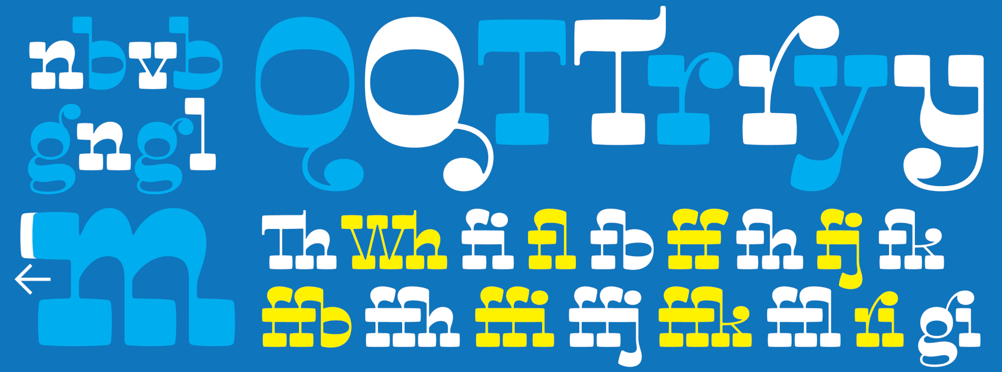
With Quirkwood, our latest release, Robby grabbed a classic archetype by the thick slabs and had a great old time jamming it full of fun. Curls and ball endings having great bouncy conversations with thick-and-thin softnesses, diagonals cutting into big rounded slabs, idiosyncratic extenders, a horseshoe U, it’s all in there.
But it’s not all just skittles and puppy eyes. The variety and versatility of this family is the expert kind of stuff that leaves no stone unturned when it comes to user options. Robby Woodard really joins the Canada Type library with a massive bang here.
Quirkwood structure and features
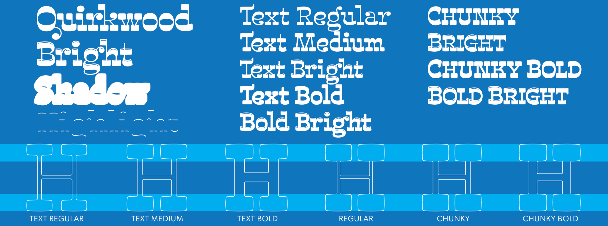
The homework online Quirkwood family has a three-tiers structure that runs the gamut from simple straightforward use to complex layering and contrast-tweaked typography. The basic four-font Quirkwood set was created with chromatic colour treatments in mind. The main Quirkwood font is complemented by a Bright inline version as well as Quirkwood Shadow and Quirkwood Highlight. These four fonts can work together to produce fantastic effects in layering. These fonts also include small caps, contextual and stylistic alternates, and quite a few ligatures of both the standard and discretionary varieties.
Next comes the Quirkwood Text set, which is a gradual weight build-up with a more tempered contrast. Three weights are there, with Bright/inline/highlight counterparts for the two heavier fonts. These fonts work well for basic display use and some bursts of text in smallish-er sizes. All five fonts contain the same OpenType features available in the fonts of the basic chromatic set.
The four Quirkwood Chunky fonts are essentially heavier small caps sets with even lower contrast for blocky heads and title settings. These are probably the closest in aesthetic to the “Western” soul of the classic archetype.
For more information and visual instances, check out the Quirkwood basic user guide here (PDF).