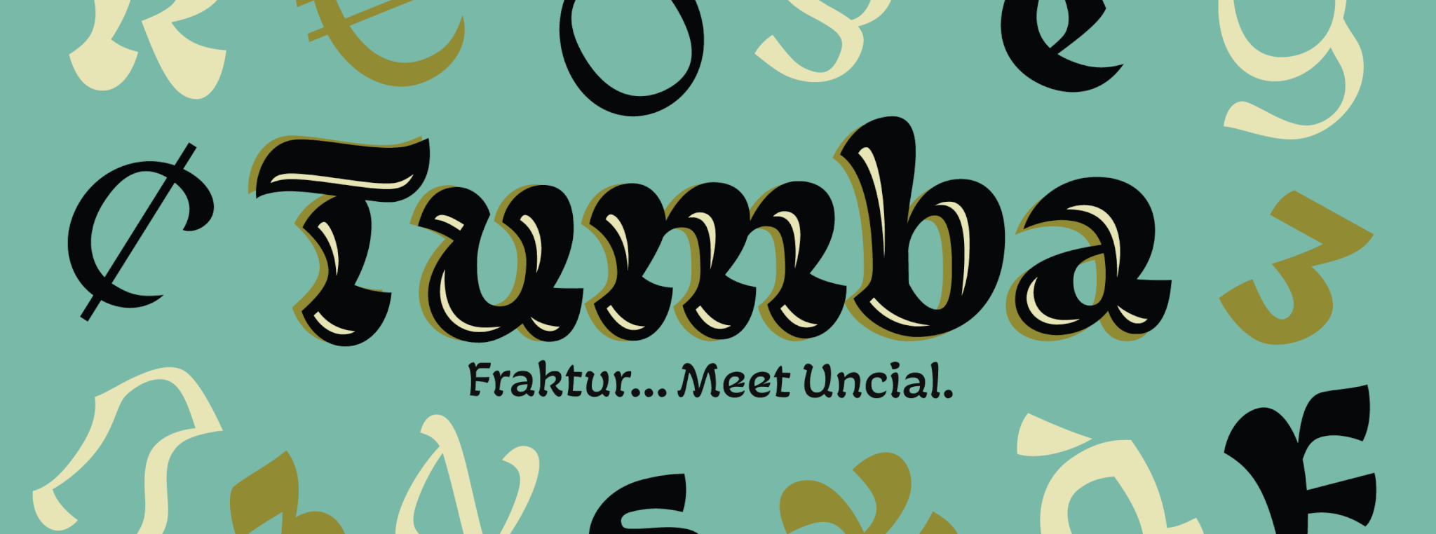
Tumba
There is something wonderfully natural about studying historical events and wondering about the long-term reverberations had things happened just a touch differently. In general, such an approach is ostensibly organic in a very academic kind of way. But when it comes to the evolution of alphabets and letter forms, asking what if raises the curiosity level from abstract theory to practical experimentation and visual presentation of different feasibilities. Major historical shifts in visual language forms happened at a very slow pace, sometimes over centuries, so any alternative moves within that realm must be delicate, subtle, and quite mindful of the tools of its time.
The Tumba family began with such a what-if proposition, then gradually grew into its own mature branch on the practical theory tree. For Jamie Chang, this typeface represents growth on multiple levels. There’s the personal growth that took place all over the world while he was a young man coming of age. There’s the professional growth he gained from specialized education and hands-on work practice. Both his personal and professional experiences over more than three years contributed to the development of this idea that uncial and fraktur can meet in one skin where they’re both comfortable.
Tumba design and family structure
At the core of Tumba’s genre-bending design is the focus on reducing the forms’ weight around the midsection, thus creating a texture reminiscent of the classic reversed-contrast aesthetic that has been all the rage over the past few years. To that effect, the majority of the strokes are downward, and follow the brush’s natural curve, then the brush reverses its course at the baseline to fatten it with terminating stroke. This resulted in typeface that fits squarely within contemporary design aesthetics while clearly nodding at both of its uncial and blackletter origins.
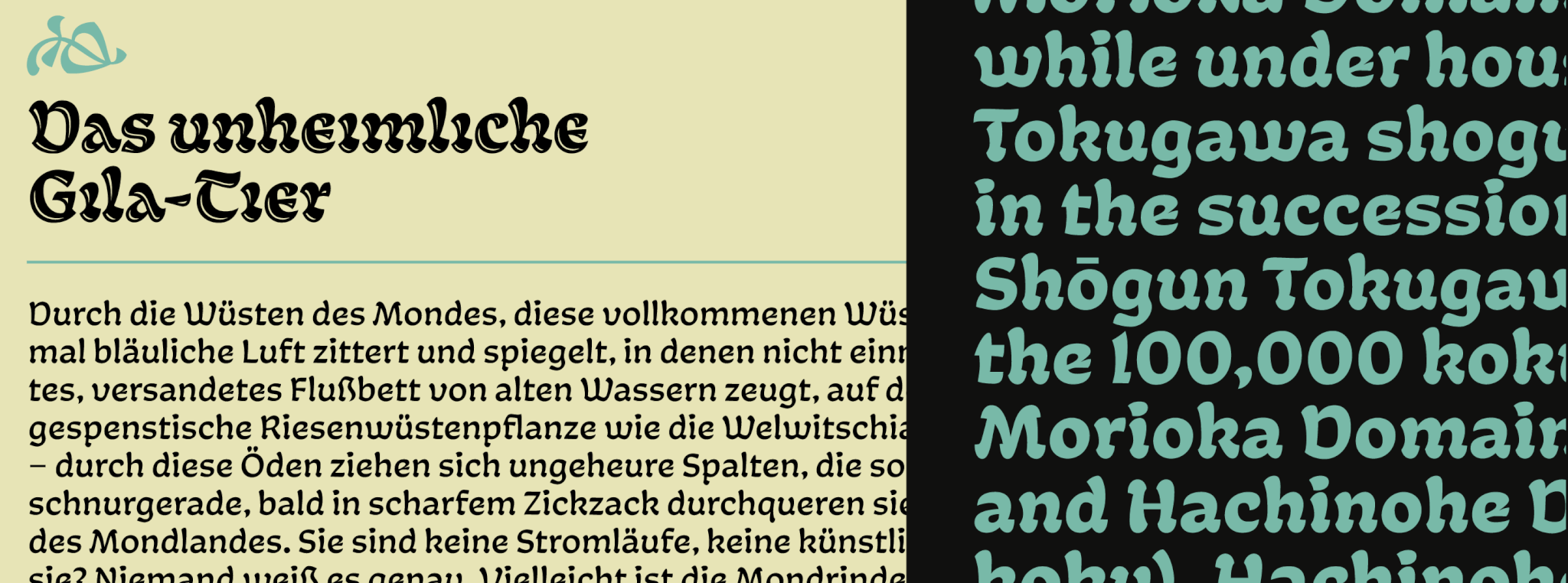
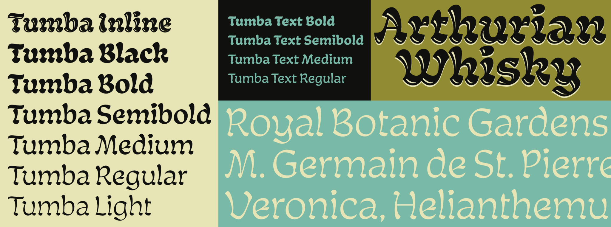
The main Tumba family is a display set of eight weights (Light to Black) and an inline font for very large sizes. There’s also a text sub-family comprised of four weights (Regular to Bold). All fonts include plenty of stylistic alternates, standard and discretionary ligatures, lining and oldstyle figures, and support for the majority of Latin languages.