Amethyst Pro
This one feels momentous and quite special on many levels. Amethyst is the typeface Jim Rimmer spent the most time scrutinizing. He was redrawing, expanding and improving it for about a dozen years. Its evolution from humble caps for in-house use into the workhorse it has now become entailed many a pair of eyeballs doing a lot of double-takes and second-guessing. And testing, lots and lots of testing.
The Amethyst typeface started its journey as a set of Goudyesque caps (initially named Maxwellian) drawn in 1994 for occasional use at the Pie Tree Press shop in New Westminster. Over the next four years, lowercase and italics were added in two weights, and initial showings of the budding set propelled it to be one of Serif magazine’s 1998 typographic design competition winners shortly before the publication went out of business. The face’s first serious press trials were conducted in 2002 by Andrew Steeves in Kentville, Nova Scotia, where Amethyst was used to set Peter Sanger’s book Spar: Words in Place and the Gaspereau Press 2002 book catalogue. Jim kept revising his design over the next few years, and by the time P22 Type Foundry began publishing his work under their Rimmer Type Foundry label in 2006, Amethyst had been redrawn and expanded into a four-weight family with accompanying italics and roman small caps.
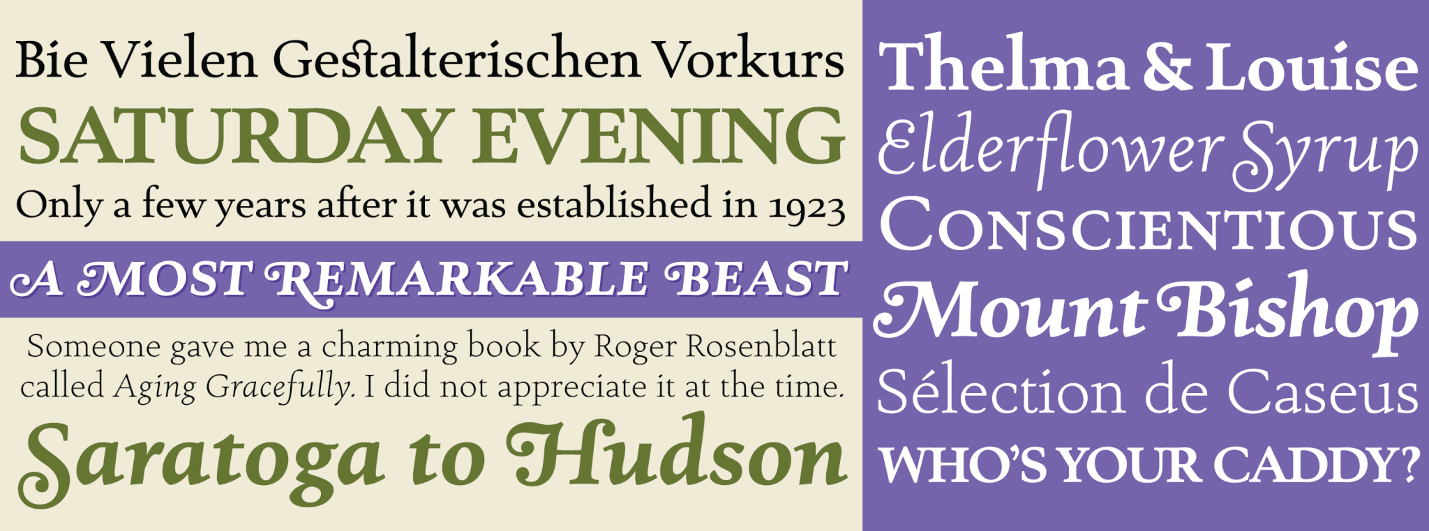
After Jim’s body of work was repatriated by Canada Type in 2012, the entire RTF library was set to undergo extensive remastering and expansion — an overarching project that would require more than a dozen years to bring to completion. Amethyst’s part of this project proved to be time-consuming and demanding in general, mainly because there were many aesthetic revisions in different versions released over two decades, as well as considerations to be made for feature additions and modern typographic layout requirements. But now that the remastering and expansion are finally done, we’re quite proud of the results. Each of Amethyst Pro’s 12 fonts includes plenty of the bells and whistles fine typography practitioners have come to expect from their tools. There are small caps included in every font, eight types of figures, automatic fractions, ligatures of the standard and discretionary varieties, many stylistic alternates, as well as italic swashes for both caps and small caps.
We tried to push Jim’s wonderful design as close as possible to its full potential, and we like to believe that our efforts would have impressed him. We know how useful this typeface is because we’ve seen it firsthand on countless occasions. We hope Amethyst Pro helps elevate your typographic work above and beyond satisfactory levels.