Normandia & Evolver v3
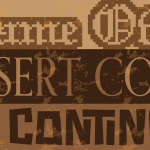
Normandia
Alessandro Butti certainly had an eye for re-weaving popular machine faces with an unmistakably humanist direction. Normandia, designed and published during Butti’s most productive period at Nebiolo, is essentially a thick Didot/Bodoni with an added touch of Renaissance. The Italian foundry made the metal face available in many different sizes to seriously go after the European publicity, publishing and packaging markets that were rapidly opening after the Second World War.
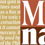
Normandia Contornata, the outline version of the design, was yet another example of the metal wizardry Nebiolo possessed — the kind of thing they’d demonstrated years earlier with the deliciously weird inline/shadow takes on their Paganini, Semplicità and Neon. This typeface was also one of the designs that helped Aldo Novarese cut his teeth under Butti’s direction before taking over himself as Nebiolo’s art director a couple of years later.
The initial publication of Normandia proved fruitful enough in the European markets targeted by Nebiolo, but it was just a few years later that phototypesetting technologies took off and upended the printing industries. The foundry never showed any inclination to get on the cold type bandwagon, so the popularity of Normandia faded fast in the 1950s, and it became largely forgotten, aside from a couple of amateurish knockoffs by small film setting outfits a couple of decades later.
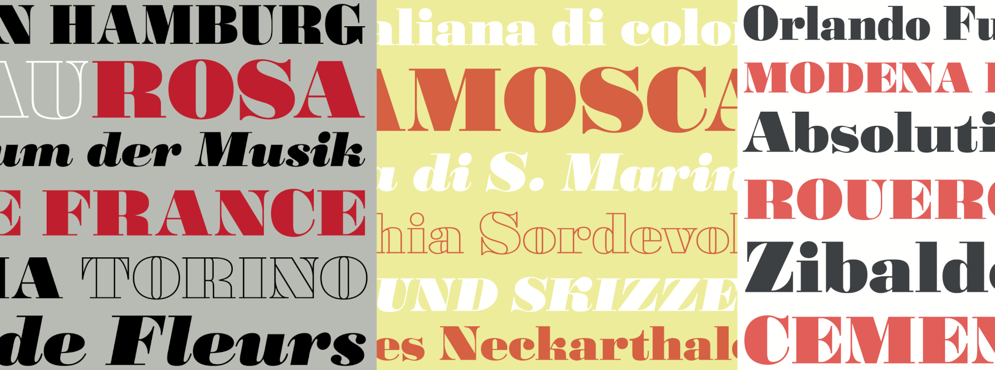
This digital version of Normandia refines and updates the three original metal designs, and expands the character set to more than 600 glyphs per font, including small caps (and caps to small caps), six types of figures, fractions and nut fractions, a full of f-ligatures, some stylistic alternates, and other fine typographic goodies.
Evolver v3
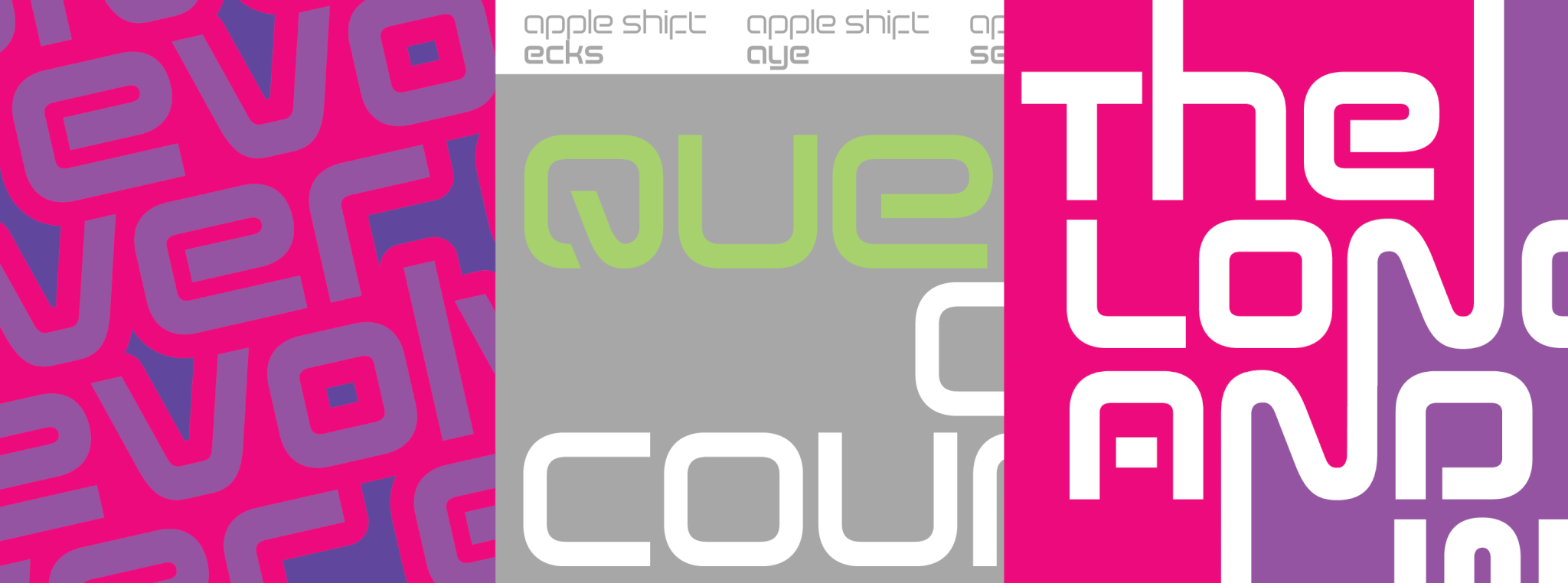
The Evolver font has a kind of cheesy backstory: Back in the mid-2000s, people around this office started speculating about what standard mainstream letterforms would look like in the far, far future, like on the branding of suits and spatial vehicles in Haldeman’s The Forever War, Heinlein’s Starship Troopers, or Pohl’s Gateway. That debate went on for days. Then the decision was very loudly made to design the Helvetica of the 23rd century, and Evolver was born.
We didn’t really have any high expectations from that font. We figured it would be used by a book cover artist or a couple of deejays here or there. And, of course, enter some street wisdom about when one least expects something. Evolver wasn’t exactly a massive bestseller right out of the gate, but it did pretty well, and within a few years there were quite a few calls for bespoke modifications and project-specific adaptations — for among others a toy company, a movie studio, a couple of game developers, and multiple electronics manufacturers.
So the result of many revisits, redesigns and expansions over 15 years is this new iteration of Evolver we’re now adding to our library. This latest version now comes in five weights, accompanying italics, Pan-European support, and a few stylistic alternates. We’re also including a two-axis (weight and slant) variable font in the complete family package. This alphabet has certainly come a long way from the two primitive techno fonts we envisioned would be commonplace on 23rd century headstones.