Ronaldson Pro
Text type design in general is a world of subtlety and intricate play between space and counterspace. But on a personal level, some older faces have a way of remaining a bottomless source of wonder and an endless carousel of mental possibilities. One such typeface is Ronaldson Old Style, an early 1880s face published by MacKellar, Smiths and Jordan, and widely considered the first original text face completely designed and manufactured in the Americas.
Aside from its unique design, Ronaldson Old Style’s distinction as an historic landmark has more to do with the collective histories that spawned it: The post-revolutionary history of the United States, the economic development of Philadelphia as a major American metropolis in the 19th century, and the evolution of political relations and trade between Europe and a relatively new country. Very highly recommended is a look into the life, times and pivotal relations of James Ronaldson who, with Archibald Binny, started the Binny & Ronaldson type foundry in 1796. B&R would later become MacKellar, Smiths & Jordan, which would go on to be the largest acquisition and main branch of American Type Founders in the 1890s.
We released a digital version of Ronaldson Old Style (named simply Ronaldson) in the spring of 2006. Getting there was a great adventure of discovery, history and new friendships. At that point in time the looming question was why it came down to Canada Type in 2006 to issue the first digital version of such an iconic American typeface. The answer to that was as mundane and dispiriting as the turnstile of technology being the principal adjudicator of which parts of history remain in collective memory.
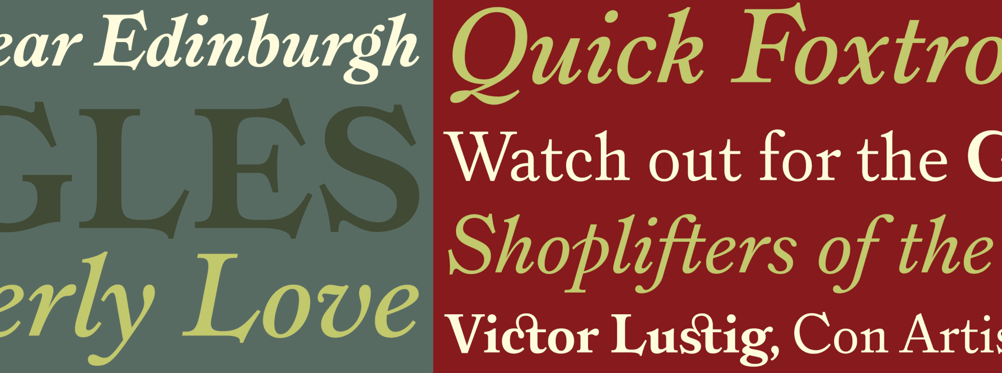
The metal Ronaldson Oldstyle was a single design made in multiple sizes, later complemented by a widely panned sloped version and too-decorative width treatments. Our digital Ronaldson family was released in two weights, an italic, and separate small caps. It became popular right out the door. Popularity meant plenty of useful feedback, which lead to Ronaldson Pro, a completely redrawn and expanded update we’re now releasing 15 years later.
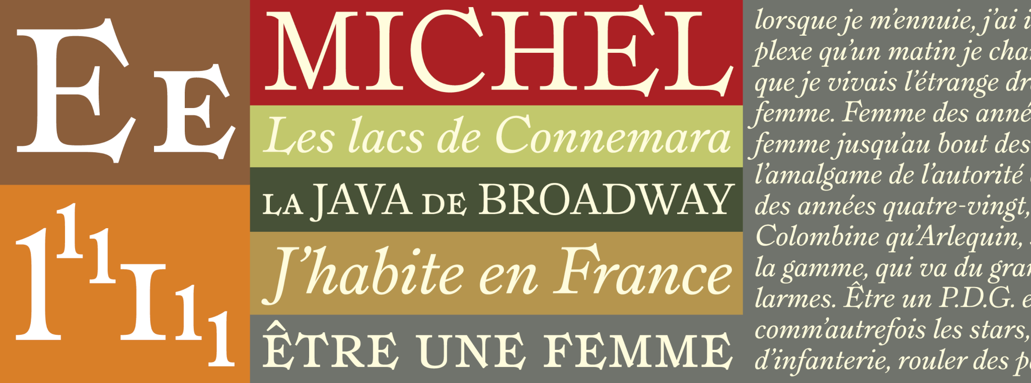
Ronaldson Pro comes in four weights with matching italics, with small caps, seven types of figures, stylistic alternates, and ligatures built into the entire family. The variable version, Ronaldson Pro VF, is complimentarily included with the purchase of the complete package. The accompanying PDF includes text setting samples and detailed information on the features available in the Ronaldson Pro fonts.