Old School Cool
No matter the breadth of your knowledge, the height of your professional accomplishments, or how long you have been doing whatever it is that you do, there is nothing as awesome as having your head space going through the steep, sometimes sudden, alternation between someone’s past working process and their work’s present possibilities.
We just published Lincoln Electric, a chromatic font set with lots of bells and whistles. Putting it together was quite the trip — a kind of a second go-round with Tom Lincoln, with whom we collaborated on Roma about a decade ago. This particular journey was a bit more special, though. While Roma was a straight-forward process adapting to modern day Lincoln’s vision and experience with the classic Trajan’s Column forms, Lincoln Electric took us into the beating heart of late-1960s New York City, a time and place of buzzing creativity, philosophical revelations, and a thriving, highly influential visual culture.
It takes the guesswork out of the equation when you get to actually talk to someone about something they did fifty years ago, though as far as process goes, plenty of caveats are still there — different ways for different times. Lincoln would say something like, “Of course this was well before the digital age”. Or, “I was working on a lengthy audiovisual project for IBM that included the first introduction of word processing, the death knell of the typewriter as we knew it”.
But sweet nostalgia and deep insight into the analog design processes of pens, inks, drafting boards, film and light were just a small part of the experience that culminated in the digital Lincoln Electric. The rewarding part was the story of a young designer leaving a famous and busy studio to strike out on his own in the dizzying lights of a highly demanding industry. It was a magical time in a magical place.
Lining up the stars
Shortly after the period in the late 1960s when he was associated with Herb Lubalin’s studio, Tom Lincoln started his own design firm. Challenged by the fast-lane typographic achievements of Tom Carnase and Ronnée Bonder, whom he had met while working for Lubalin, he was inspired to create a spin-off treatment of Bifur, Cassandre’s classic art deco all-cap face from some three decades prior. He used Bauhaus ideas to remix Cassandre’s basic concept of precise yet somewhat arbitrary thin gridlines interacting with thick strokes to construct alphabetical forms. The minimalist geometry he used resulted in an attractive high-end alphabet that was much more legible than the groundbreaking deco face, and certainly much more in sync with where aesthetics were at the time.
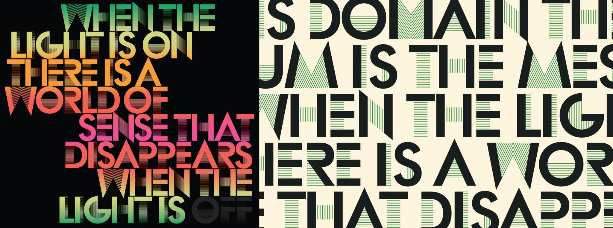
To promote his new business, as well as to test the typeface, he designed a poster utilizing a theme consistent with the intellectual pronouncements of Marshall McLuhan, the media guru who in 1964 had set the advertising world on fire with his book Understanding Media. The poster (a poor man’s digital replica of which is in the image above) featured one of McLuhan’s most famous lines: “In this domain the medium is the message, and when the light is on there is a world of sense that disappears when the light is off.”
This synergy of landmarks (Bauhaus/Bifur/McLuhan) Lincoln employed was no mere crapshoot. One of Lincoln’s promotional collateral designs (a 6×9 folder featuring a pen-and-ink drawing of a lightbulb made out to look like a somewhat alien face built around another McLuhan quotation) had just won an award at the Typomundos/20 show in Paris. Clean, minimalist geometry and bright colours were outpacing deco by light years in New York City. So this kind of magnetic triplet made quite a bit of sense, though from a business perspective it could have been construed as a bit of a gamble at a time when design trends were quite shifty and linear processes were being increasingly supplanted by mosaic ones.
Hibernation & awakening
Lincoln’s gamble, if that’s what it was, paid off handsomely. At the headquarters of Pantone Matching Systems in Carlstadt, New Jersey, the plant manager offered to print the poster for free if he could experiment with a split fount process he was exploring, in which inks of different colours were blended on the press rollers to produce a sort of tie-dye effect for the letters. The poster received accolades from hipsters at NYC’s Electric Light Station in the east village, and brought in enough work to start Lincoln off on his way to becoming one of the premier designers in New York City for the next few decades. The stories he now tells about those times make one take a deep breath and get real high at human creativity, hope, and how our history is really made from a multitude of the subtlest connections.
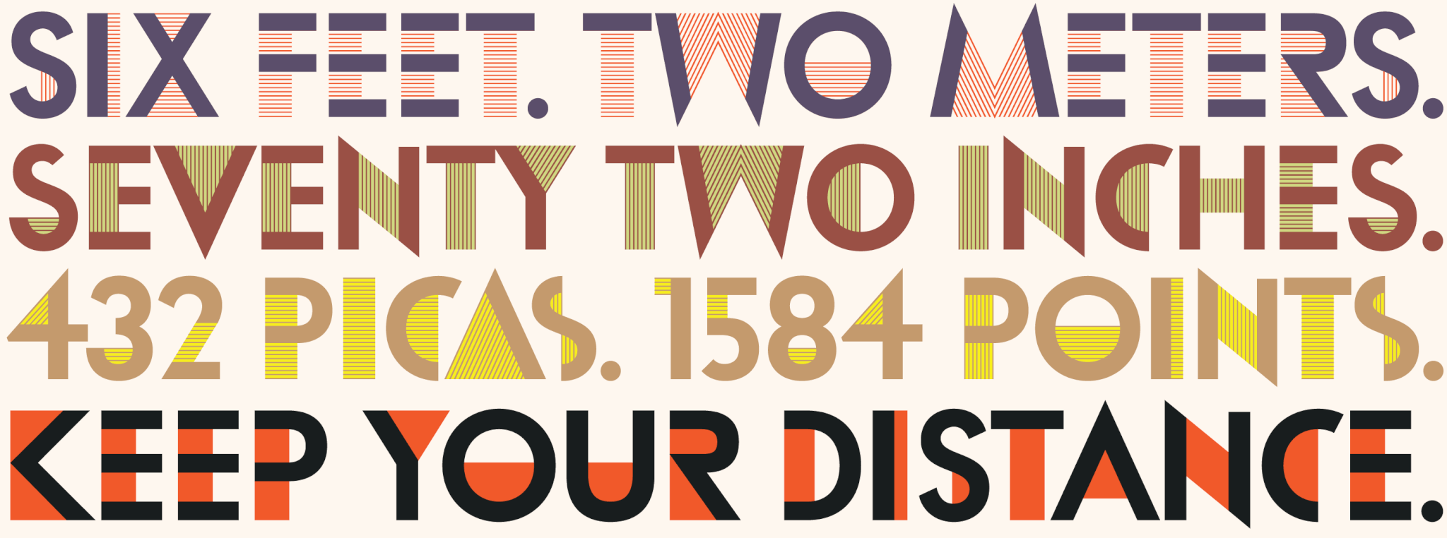
Some fifty years after Lincoln Electric admirably performed its intended purpose, Tom found its source materials laying dormant in a flatbed drawer among his archives. One can only imagine the range of emotions he must have gone through travelling so far back. He brought it over to Canada Type, where it was a no-brainer to jump on the chance to add a well-deserved chapter to its history by bringing it to the digital age in style. We think we did a pretty good job, and we hope you agree. This set of fonts can easily be a powerful designer tool. To test it out and read up on on its features, take a look at its page in our font library.