Branching Out
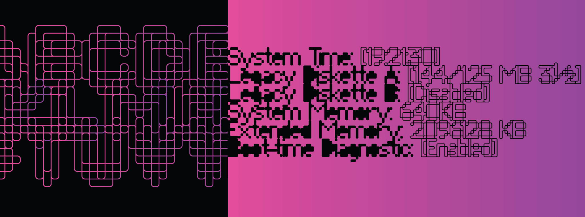
The graphic above is just a sneak peek into the amazingly detailed design mind of Corey Holms. It’s more likely than not that you’ve seen this guy’s work and have been moved by it at some point in your life. Corey is a graphic arts veteran (we call him Hollywood behind his back) who’s been a kind of go-to guy for entertainment design and branding on the west coast for about a couple of decades now. Not that you know it from talking to the guy. He’s one of the humblest, most thoughtful and understated creative people you would ever meet. You can see some of Corey’s excellent work here.
Compunabula
So for the past 10 months or so, we’ve been working with Corey on remaking and updating some fonts he had out there some years ago, great original works which he at some point discontinued because he was discouraged by the frustrating load-and-forget nature of font distribution channels. All those fonts are gradually coming back to life as very well-pampered quality Canada Type exclusives over the next months. Compunabula (the one shown in the graphic above) is the first one out the door, and more will be coming soon.
Compunabula is such a delightful trip, one of those unique designer creations that first make you think then induce an urge to build things out of typesetting. Alongside the different weights and overlaying possibilities, some extra magic is included in there, from contextual alternation for seamless flow to shapes mazy enough for a good old flashback. Fiddle with the type tester on the Compunabula page and see for yourself. Designers live for this kind of intricacy and weird coolness.
The other Hollywood
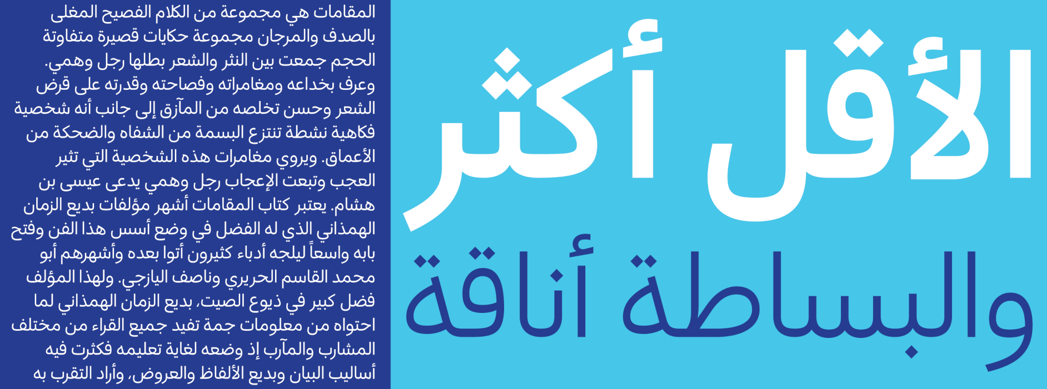
Now here’s a weird east/west combination we couldn’t have even dreamed up, let alone planned to happen the way it did. The other release we’re announcing here is an Arabic font family called Anaqa, which we developed in collaboration with Kourosh Beigpour, the Los Angeles-based Arabic typography superstar. We call him Hollywood behind his back (where did you hear that one before?) — If Corey and Kourosh are ever in the same room, nicknames be damned or cue the confusion. But seriously, Kourosh is another amazing designer whose typographic tapestries can leave you in awe. Take a look at some of his cool work here.
Anaqa
What started out as a simple ask for an Arabic companion to the Semplicita Pro family became a five-weight family that can complement pretty much any humanist sans out there. This is partly due to the calligraphic nature of the Arabic script, but achieving this level of transliteration of Latin humanist typography onto flowing Arabic forms can only be done through serious expertise and depth on both sides of the aisle — which Kourosh Beigpour possesses in spades. We couldn’t be more pleased with the results. In fact, we’ve got immediate plans to do some more work with Kourosh, and hopefully we can keep this kind of synergy going for a good while.
Anaqa means sophistication or fashionability in Arabic, so we thought it would be a good, representative name for this typeface — simplicity being the ultimate sophistication, and what have you. It’s amazing how individual shapes can be reduced to their bare definition yet still manage to cleanly assemble into such a wonderfully complex totality. Here’s hoping you’ll get to love it as much as we do.


 Copyright © 2024 Canada Type. All Rights Reserved.
